How would you like your error message?
Error messages are the mysterious pitfalls of the internet world. These errors sometimes pop up during payment for our food orders, and sometimes we encounter them when we try to use our free moves while trying to make a new move in the Candy Crush game. 🤯
In any case, these error messages quickly bring to mind questions like "What now?" and "What should I do next?" Unfortunately, many error messages are poorly written and can be quite frustrating. I'm here to provide you with a guide to help you better understand error messages and explore ways to create more engaging and enjoyable ones.
🏃🏻♀️ Let's start!

Use plain language
Forget technical jargon. Error messages often have complex terms that users might not understand. To make error messages more user-friendly, use simple and clear language. For instance, instead of saying "HTTP 404: Page not found," you can say "The network connection is lost" which is easier for everyone to grasp. 🥲
Be specific
Explain what went wrong and why, in a way that your users can understand. This means providing enough information so that your users can understand the problem and take steps to fix it.
🤔 For example, instead of saying "An error occurred," you could say "The email you sent is too large. Please reduce the size of the email or send it in multiple parts.”
Be actionable
Tell your users what they can do to fix the problem. This means providing clear instructions on how to resolve the issue. For example, instead of saying "Please contact support," you could say "To fix this problem, please go to your account settings and update your password."
Be positive and helpful.
Avoid blaming your users or using negative language. This means using a friendly and supportive tone in your error messages. For example, instead of saying "You entered an invalid password," you could say "The password you entered is incorrect. Please try again."
The end
Error messages offer opportunities to make the user experience more enjoyable and informative. By leaving behind technical jargon and adopting a fun approach, you can make your website or application more appealing and user-friendly. Remember, sometimes an error can be a fantastic opportunity to surprise users with something sweet! 🥳
Here are some examples:
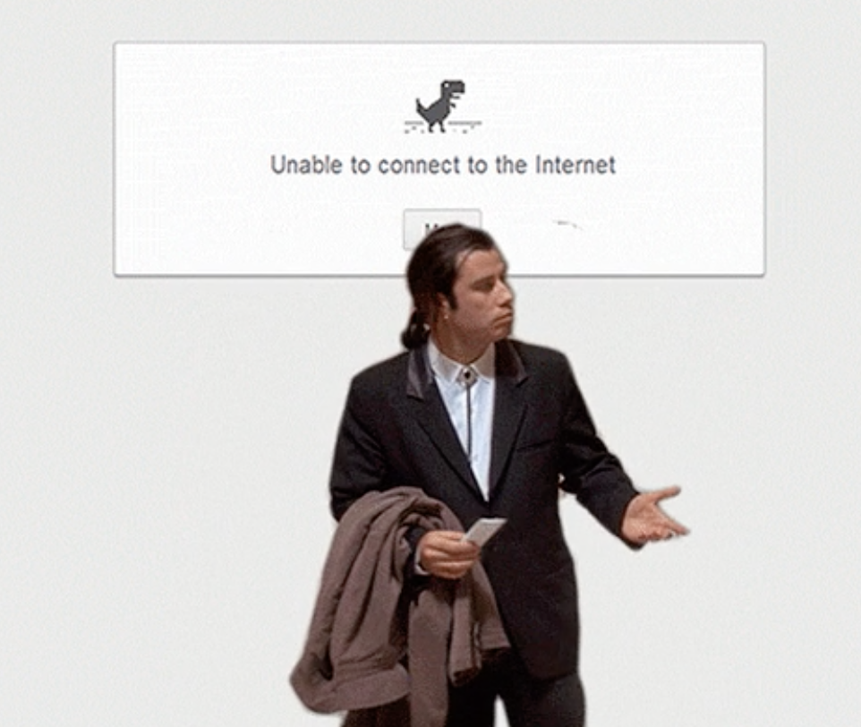
- Quite understandable - a short and concise error message. It could have given more detail, but it's a good example in terms of simplicity.
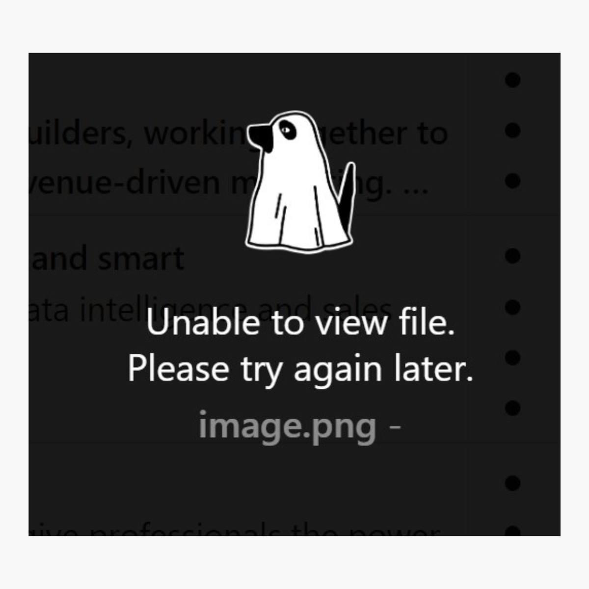
And 2 funny examples...
One is a text we encountered in the underground - the other is a text found on the internet, but both are similar to each other.
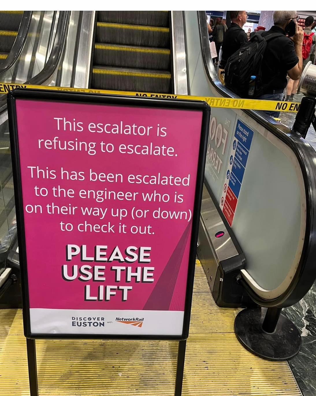
How about this?
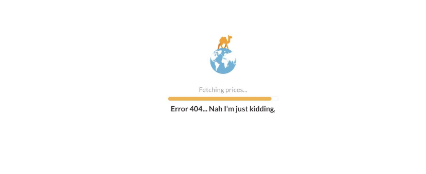
While they could be a source of momentary happiness for people, even looking good - in risky and challenging areas, such humorous texts can be irritating. So, make sure you work with a good Content Designer. 🤭